Testing contrast ratio
Have you been using GEN-AI to check contrast values from images of your web application? Well, there is a much more reliable way, and p.s. you don't have to use a kilowatt of electricity for it.

Sampo Kivistö
Founder & CEO

Testing contrast ratio
Contrast ratio is an important measurement for accessibility. It is used to determine how easy it is to read text on a background. The contrast ratio is calculated by comparing the luminance of the foreground and background colors. The higher the contrast ratio, the easier it is to read the text.
W3C has created a Guideline for contrast ratio. The guideline states that the contrast ratio should be at least 4.5:1 for normal text and 3:1 for large text. If you have heard people complaining that the text is too small to read in your application, it might be an indication of a bad contrast ratio.
How to check contrast ratio
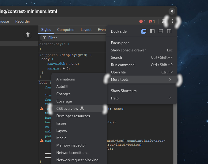
You can check the contrast ratio using Chromium developer tools. Open the web page and click F12. Then click on the three dots in the top right corner of the developer tools window. Then select "More Tools" and select "CSS overview".
Click "Capture overview" and wait for the overview to be generated.

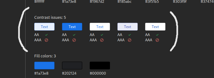
The Colors section highlights the used colors on the current page. If any contrast issues were found, they will have a red cross below the font color.

By clicking the reported color, you can see element selectors where it is used on the rendered page. Now let's fix them together and make the web pages more accessible for everybody.
Would you like to automate contrast ratio checking throughout your application? At AutoExplore, we are committed to helping R&D teams implement autonomous testing as part of their development processes. Ready to transform your process? Contact us for a demo to learn more.